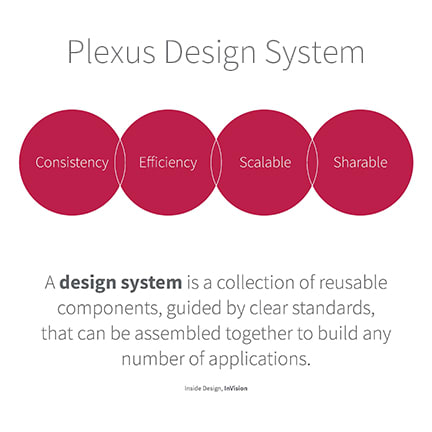
Plexus design system
Summary
Design, development, and transformation of Plexus' e-commerce user experience.
Role
Sr. Manager, UX/UI: responsible for leading and contributing individually on a team of UX designers and content managers in an Agile scrum environment.
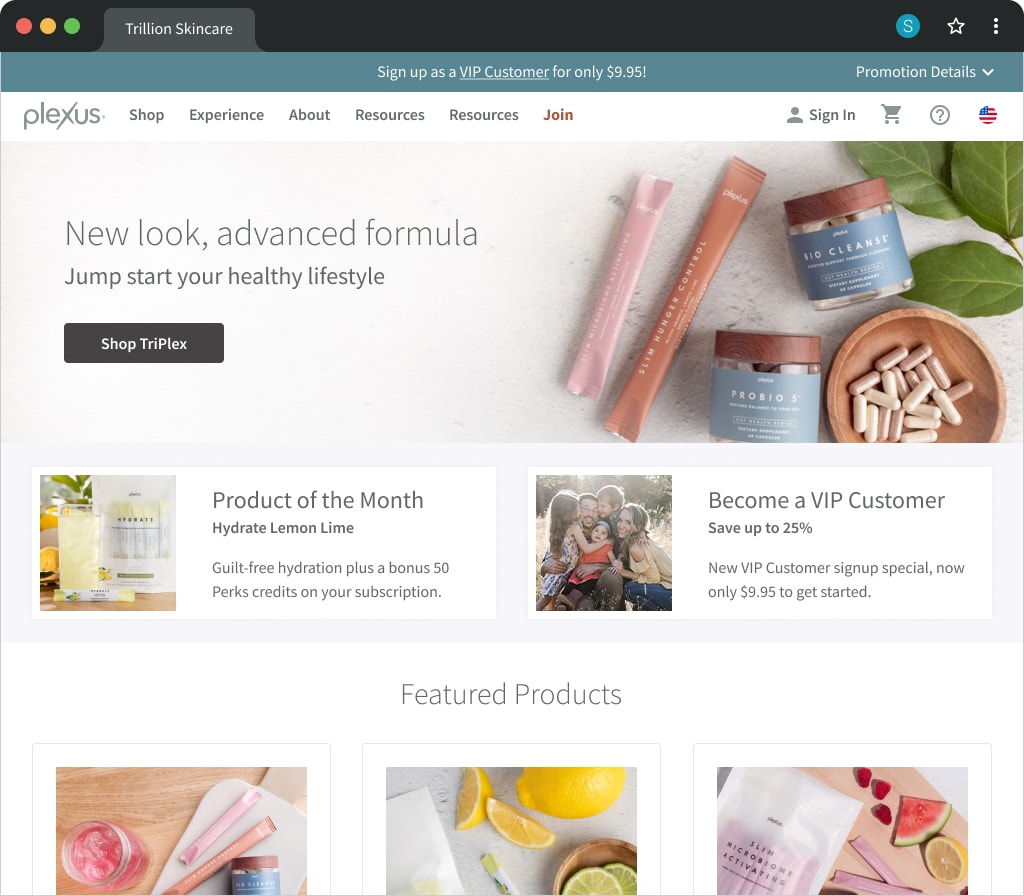
Final designs
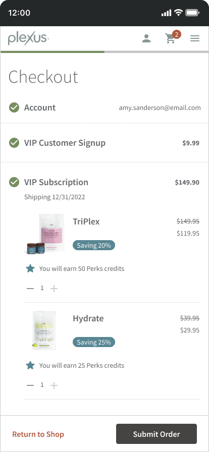
Home, Shop, and Checkout


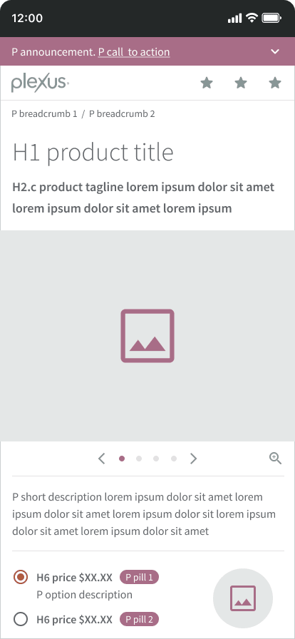
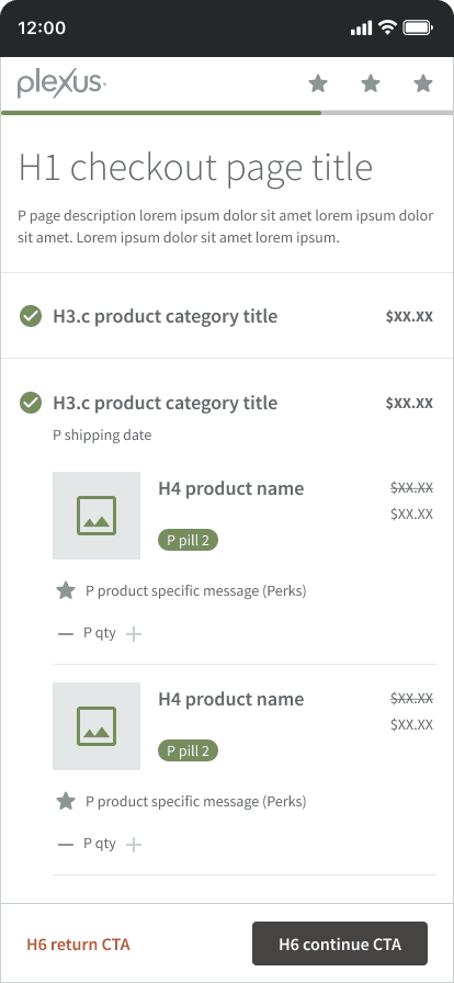
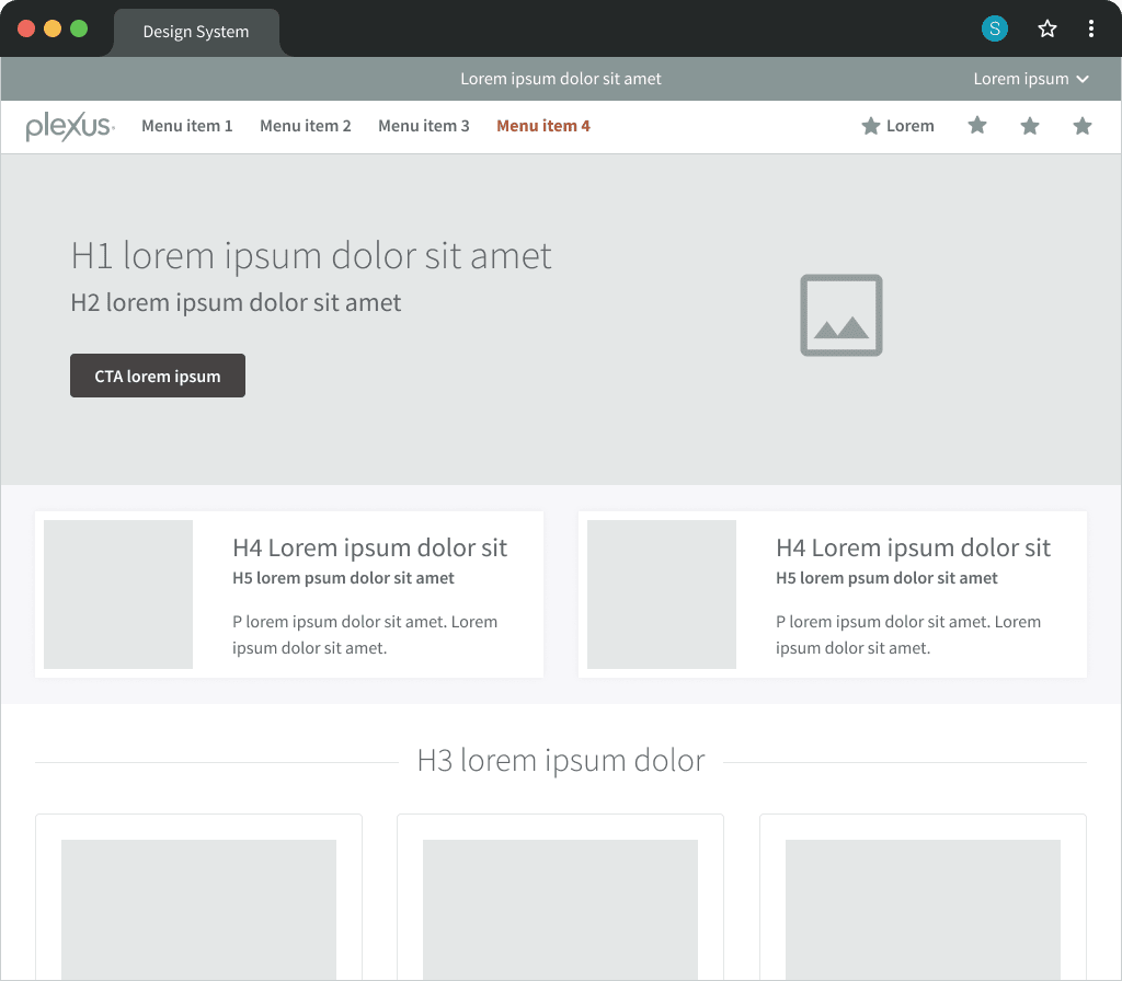
Page template mockups
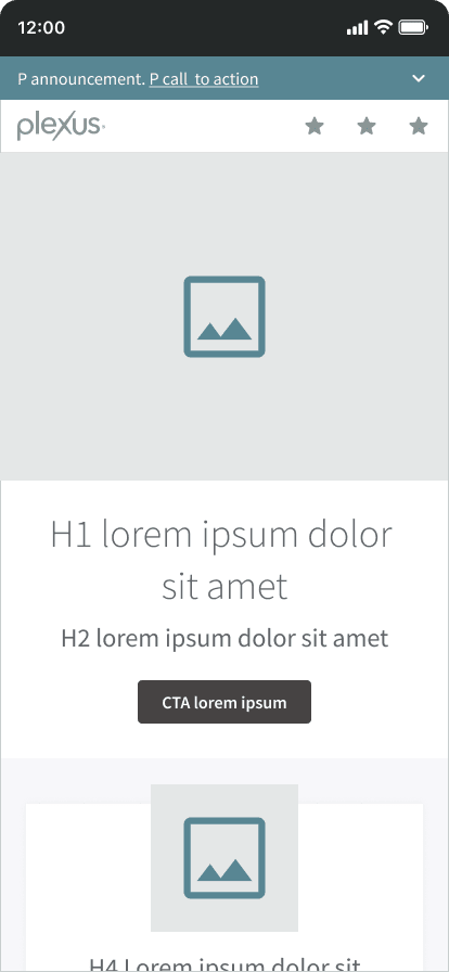
Desktop homepage
Overview
Goals
- Improve user experience and usability of product
- Define interface guidelines, styles, and components
- Deliver a Plexus Design System "style guide"
- Implement process efficiencies to reduce workload and speed-to-market
Strategy
- Perform audit and take inventory of existing brand assets
- Design and develop re-usable system of styles and components
- Build a design library that integrates with the codebase
- Collaborate with Agile teams on implementation and the design-to-code workflow
Results
25% reduction
Resource requirements
WCAG AA
Passing accessibility standards
UX process
Discovery
The project team identified goals, technical limitations, and processes. With approval obtained, the team set forth with an audit of the current design and development stack. Documentation was soon prepared, and Agile ceremonies began.
Current site audit
Executive presentation
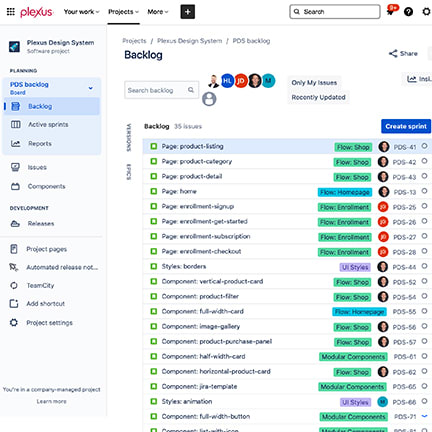
Agile scrum project (Jira)
Design
The design system was crafted to include a more modern and aspirational look-and-feel. Foundational styles were updated, reducing emphasis on the non-interactive interface to highlight new content and the primary interactive elements.
From a technical standpoint, the team elected to remove Bootstrap and leverage Google's Material design components and the React framework. All styles, components, and coding passed WCAG AA standards.
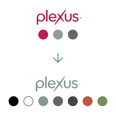
Brand evolution, simplified
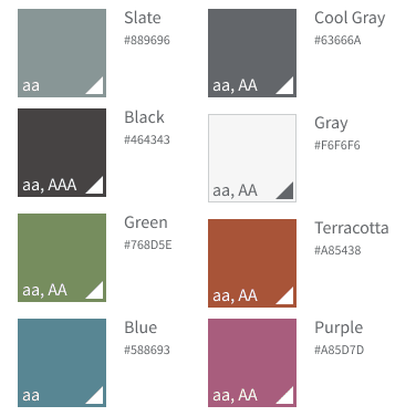
Main color styles
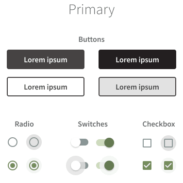
Primary interactive elements
Build
With design assets ready for development, prototypes and the documentation site took form. A presentation of best practices was prepared and shared with executives and stakeholders announcing the launch.
Iterate
The Plexus Design System remained an ever-evolving collection of styles, components, and content. Frequent updates were made, analyzed, and iterated upon.